
Around a year ago I was building a component library for my personal projects – Fxtrot UI. Learn once – use everywhere. Regardless the idea I have, I don’t need to think again what I should use for building the UI.
At the time, I already had the stack I believed in, using CSS-in-JS library stitches. It provides a great DX with theming, variants for class names mappings and all that is type-safe.
const Button = styled('button', {
  variants: {
    tone: {
      primary: {
        backgroundColor: '$primary',
      },
      success: {
        backgroundColor: 'green',
        borderColor: 'green'
      },
      danger: {
        backgroundColor: 'red',
      }
   }
});

// tone is a prop with correct suggestions, mapping to correct className
<Button tone="primary" />
While I still believe it was a good choice, things tend to change:
- the plan to generate atomic CSS classes was abandoned (not lightly);
- React 18 brought some concerns for CSS-in-JS libraries;
- the team behind
stitches, Modulz was aquired by WorkOS, putting its OS projects at question; - adding important functionality, like static extraction, to stitches was hence paused;
I won’t repeat after others, but producing CSS at runtime is both, client overhead and just not needed. There is no purpose for your CSS to be that dynamic. stitches showed how a good DX can look like, and tools like Vanilla Extract also provided the convenience of a similar API for components variants through Recipes package:
import { recipe } from "@vanilla-extract/recipes";

export const button = recipe({
  base: {
    borderRadius: 6,
  },

  variants: {
    color: {
      neutral: { background: "whitesmoke" },
      brand: { background: "blueviolet" },
      accent: { background: "slateblue" },
    },
    size: {
      small: { padding: 12 },
      medium: { padding: 16 },
      large: { padding: 24 },
    },
    rounded: {
      true: { borderRadius: 999 },
    },
  },
});
Even more, working with plain CSS at Skyscanner reminded me how awesome the experience could be, both, in editor intelligence and CSS freedom. It made me think how alienated it actually is to write JS objects for CSS:
const style = {
  [`${otherStyle} &`]: {
    backgroundColor: "white",
  },
};
So, the requirements were pretty simple:
- Be able to write plain CSS.
- Allow configurable theming.
To me, this reads as “just use plain PostCSS with CSS variables”.
Fighting the urge to see everything as a nail#
What I noticed pretty early building my components in plain CSS is how difficult it became combining them into useful UI elements.
Before:
<Box p="4">
  <Row gap="4">
    <Button>Save</Button>
    <Button>Cancel</Button>
  </Row>
</Box>
After:
import STYLES from "./Styles.module.css";

<div class={STYLES.container}>
  <Row gap="4">
    <Button>Save</Button>
    <Button>Cancel</Button>
  </Row>
</div>;
I migrated Row element that would cover most common layout composition with flexbox, but I still had to create a CSS file every time I need to do something “out of the box”, something that component library does not provide.
Another thing I noticed working on big production systems, is that Design System implementation CSS has different concerns from the actual product CSS. Design System CSS is all about consistency, flexibility and maintainability. It often requires complex selectors like:
&:where(:focus-within, :hover):not(:disabled) {
  background: var(--colors-primary);
}
The consumer of such Design System will rather be concerned about composing those UI components and providing the layout layer:
.container {
  display: flex;
  align-items: center;
  gap: var(--spacing-4);
}
And that’s great. I wouldn’t want product features to include any complex CSS. If there’s a need to write an interactive element with effect on :hover, maybe there should be a primitive in Design System for that instead, like <Hoverable>? Otherwise, they could miss that :hover styles should probably be also applied when the element has focus, for keyboard users.
Coming from CSS-in-JS and Styled System, I truly believe that a perfect Design System provides developers all the primitives to build UI without writing any CSS, but as a composition of primitives and their props. So instead of:
<div className={STYLES.container}>
  <div className={STYLES.cardWrapper}>
    <Card className={STYLES.changePaddingBecauseThisUseCasesNeedsADifferentOne}>
      <Content />
    </Card>
    <Button>Cancel</Button>
  </div>
</div>
We could work with:
<Box p="2">
  <Column gap="2">
    <Card>
      <Box p="4">
        <Content />
      </Box>
    </Card>
    <Button>Cancel<Button>
  </Column>
</Box>
First, it’s expressive. You can already imagine that a Box provides some padding, Column will render a Card and a Button in a column, with a gap in between. All this without looking at the separate .css file.
My thinking at this point was pretty narrow already. I don’t want another CSS-in-JS for a Box component, but I do want to provide devs a simple way to collocate styles with the markup.
Becoming a cautious fan of Tailwind#
As I was already interested in TailwindCSS, and the community was visible and strong, it finally clicked for me why people liked it so much:
<div class="p-2">
  <div class="flex flex-col gap-2">
    <Card class="p-4">
      <Content />
    </Card>
    <Button>Cancel</Button>
  </div>
</div>
This is expressive! With good setup and a component library, developers are enabled to leverage all the benefits promised by TailwindCSS:
The ultimate aim of the Design System has become to empower developers with a suite of accessible building blocks, allowing them to efficiently craft interfaces that are both scalable and consistent.
TailwindCSS is not for building component libraries#
The first thing I saw immediately was the reason people don’t like Tailwind. Writing a component library using plain Tailwind classes on primitives just does not scale, class names get too long, sharing the styles becomes questionable (or repeatable), you are restricted in selectors by Tailwind’s syntax:
const button = css({
  variants: {
    tone: {
      action:
        "bg-primary hover:bg-primary/80 hover:border-primary focus:bg-primary/80 focus:border-primary text-on-primary ",
      danger:
        "bg-red/70  hover:bg-red/80 hover:border-red focus:bg-red/80 focus:border-red  text-white",
      success:
        "bg-green/70  hover:bg-green/80 hover:border-green focus:bg-green/80 focus:border-green text-white",
    },
  },
});
It’s is a simple example, but there’s no way it’s more maintainable than just CSS. With the power of unrestricted selectors usage we can just:
.button {
  display: flex;
}
.button-tone--action {
  background-color: theme(colors.primary);
  &:where(:hover, :focus) {
    background-color: theme(colors.primary/0.8);
    border-color: theme(colors.primary);
  }
}
.button-tone--danger {
  background-color: theme(colors.red);
  &:where(:hover, :focus) {
    background-color: theme(colors.red/0.8);
    border-color: theme(colors.red);
  }
}
It’s about the same amount of characters, but much easier to read and maintain. I believe that a general rule for Front End development should be: be more explicit in your source, especially if it does not affect the resulting build. And unless you work with monorepo or ship your component library pre-transpiled, you won’t gain much from using plain Tailwind classes.
Explicit approach also benefits heavily from being able to use native CSS features, like @container queries or @layers support without waiting for TailwindCSS to implement them.
Another thing you could notice is that I chose not to use Tailwind’s @apply:
.button {
  @apply flex;
}
.button-tone--action {
  @apply bg-primary;
  &:where(:hover, :focus) {
    @apply bg-primary/80 border-primary;
  }
}First, the same general rule for Front End development applies: don’t be implicit if it doesn’t bring any benefits. Both classes will produce same CSS, but second is more explicit and is very easy to read, understand, modify, move away from TailwindCSS.
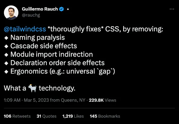
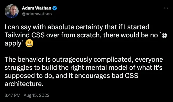
Second, one of the creators of TailwindCSS regrets himself about the introduction of @apply:
The result#
I truly believe that a good design system is essential for the velocity of application development. Wrong tools or abstractions will eventually lead to slow delivery or a huge burden on the users of the app. TailwindCSS is the right choice, with great ecosystem for building web applications while not imposing non-platform features:
- Tailwind Configuration file allows you to impose the rules. For example, adding CSS Logical Properties or theming through CSS variables;
- You can (and sometimes should) just use plan
.cssfiles withthemesyntax, to leverage Tailwind’s styles consistency, but be closer to the platform; - TailwindCSS VS Code extension provides autocomplete for
theme(spacing.2)syntax in CSS, or when writingclassNames;
Fxtrot UI is an accessible* React component library that supports theming and provides a TailwindCSS plugin for the consumers of the lib to write consistent UIs.